

- Client:Emergency Essentials
- Categories:Amazon A+, Ecommerce & Web, Packaging
Emergency Essentials — 30-Day Be Prepared Food Supply
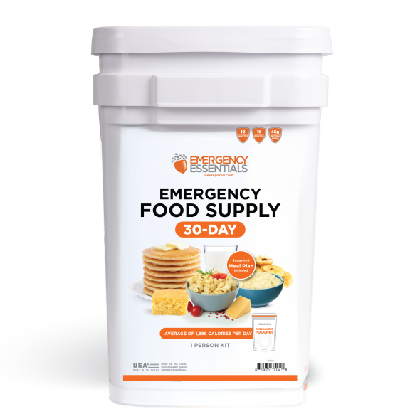
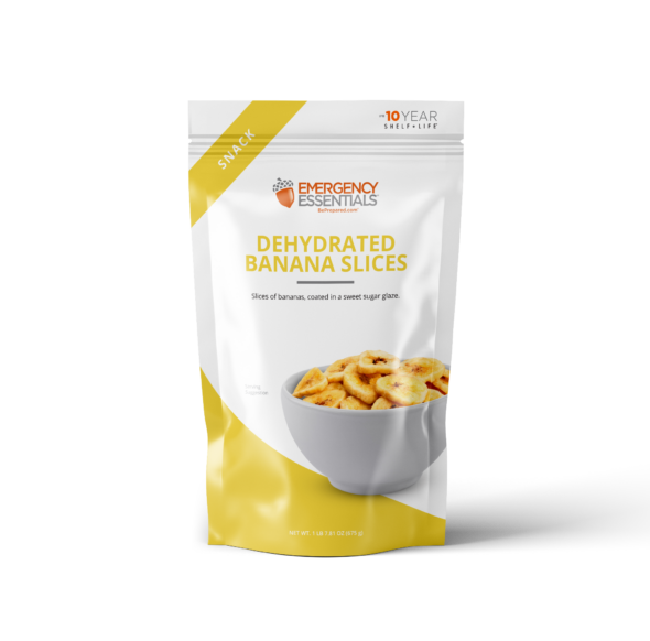
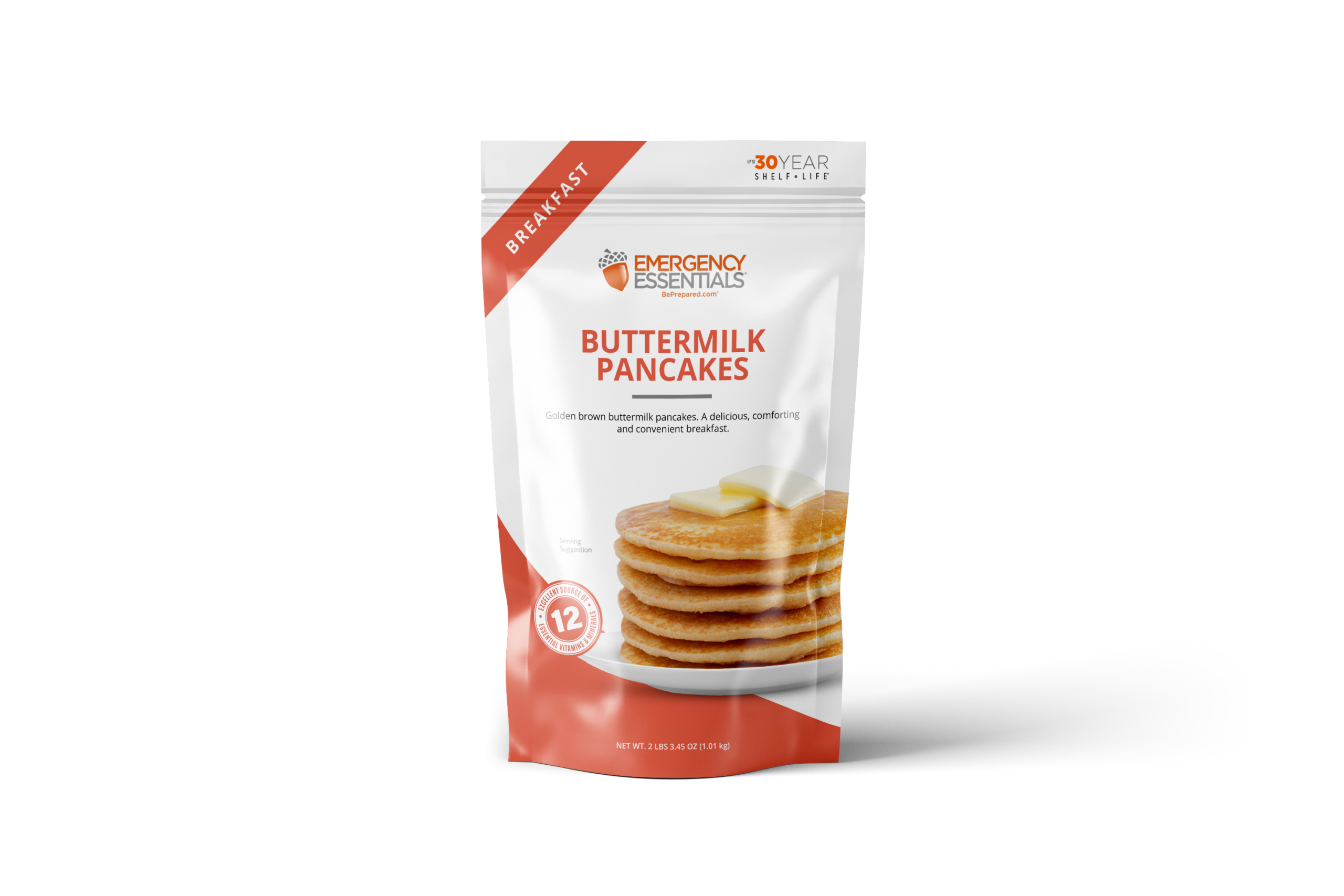
This project was a full visual refresh for the Emergency Essentials 30-Day Be Prepared Food Supply, spanning everything from the core brand direction to the individual packaging and digital launch assets. I developed the overall visual system, including the color palette, typography, graphic style, bucket labels, and packaging system used across the individual food pouches.
Each pouch was designed as part of a larger family while still giving individual products their own identity through color coding, food photography, category callouts, preparation instructions, nutrition information, and product-specific details. The system needed to remain cohesive across a wide variety of meals, sides, breakfasts, snacks, and drinks while making the products easy to identify.
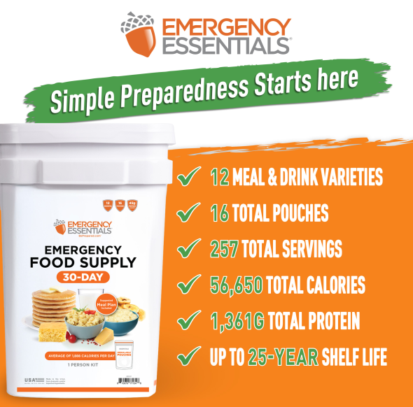
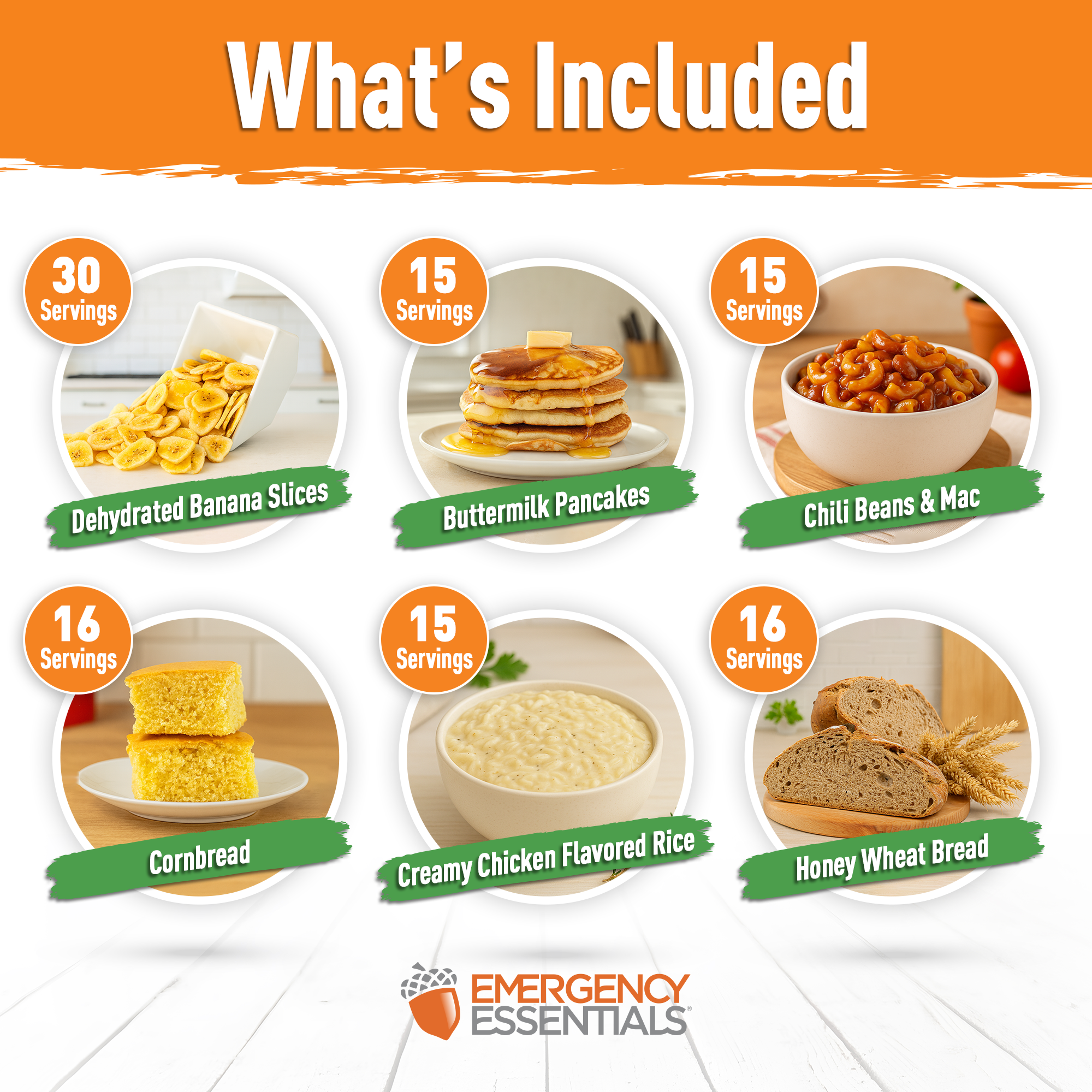
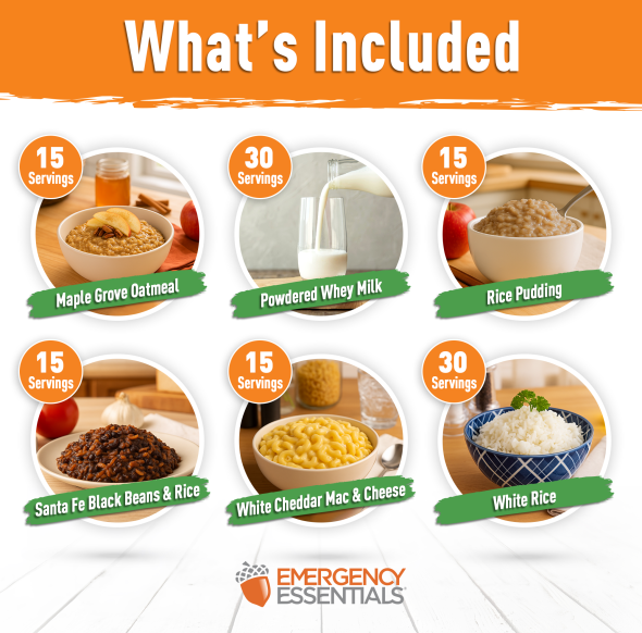
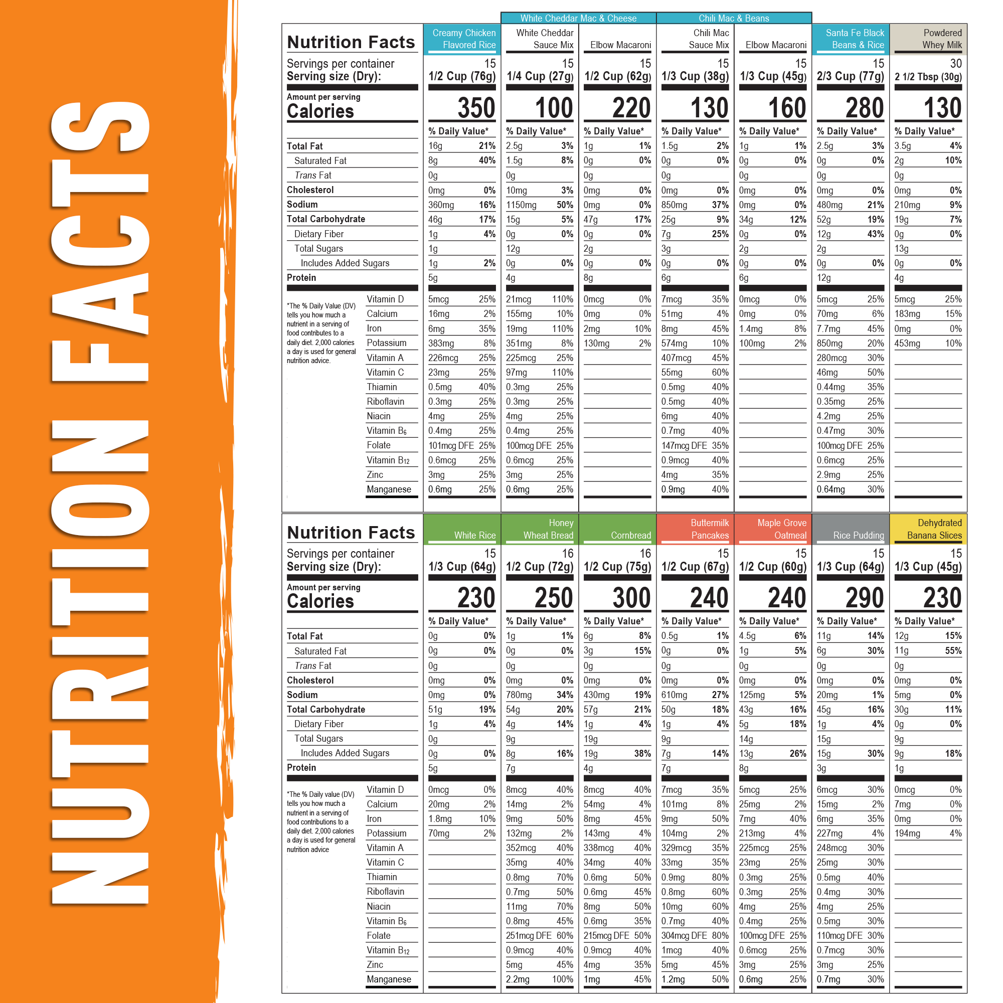
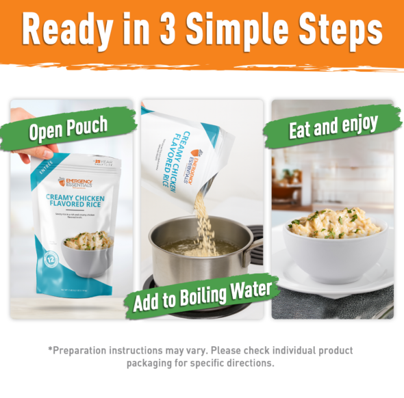
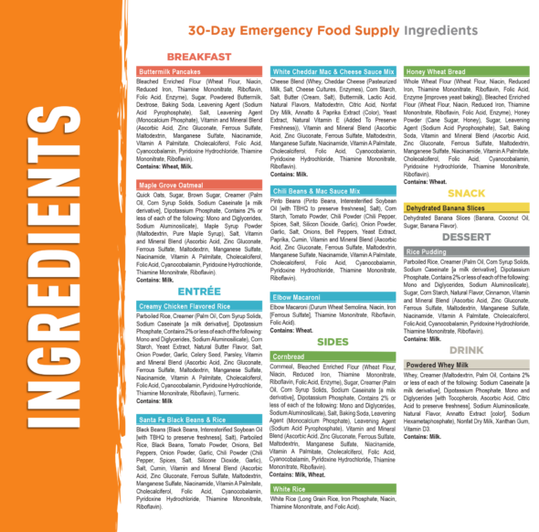
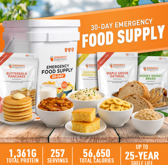
I also carried the new visual direction into the Amazon experience, creating the A+ content and product imagery for the 30-day kit. These assets were designed to communicate what’s included, serving counts, nutritional information, preparation, shelf life, and other key product benefits in a way that was easy to understand at a glance.
The project went through several rounds of exploration and changes in direction before arriving at the final system shown here. That process required continually refining the design while keeping the growing number of packaging and digital assets consistent, ultimately creating a flexible visual system that could scale across the entire product line.
Solutions
- Brand & Visual Design
- Packaging Design
- Art Direction
- Color System Development
- Amazon A+ Content
- E-Commerce Design
- Product Photography Direction & Compositing
- Production Design
Tools
- Adobe Illustrator
- Adobe Photoshop